coco rae studio
Logo and Brand Design for
ROOTS Premium Gym and
ROOTS Premium Gear
-
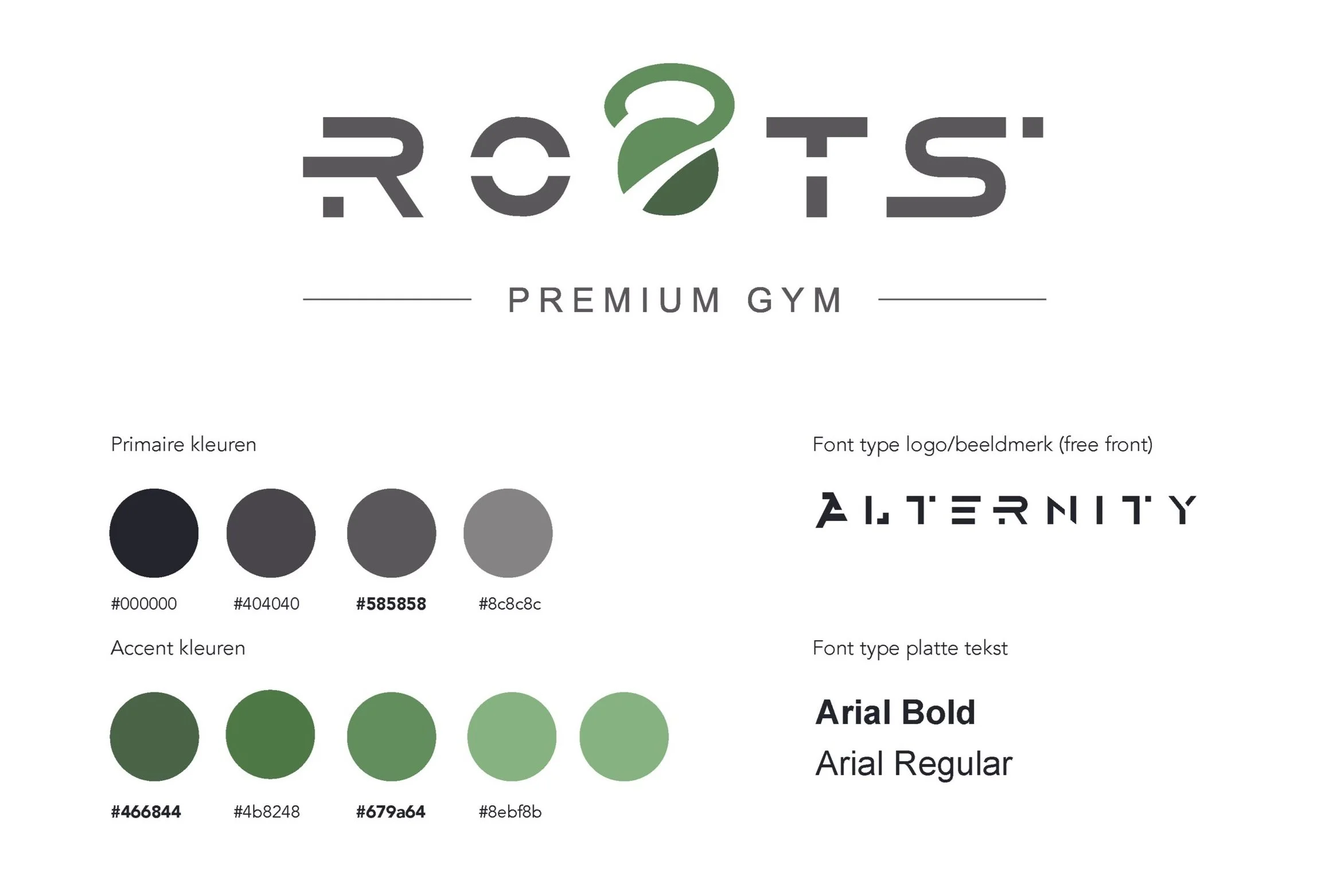
In 2021 I was hired to create a Logo and overall Brand Design for ROOTS Premium Gym.
Their main Brand Promises consisted of three slogans:
WE KNOW YOU
WE CHALLENGE YOU
WE LIFT YOU UP
Their goal for the brand was to offer diversity and commitment to employees and members. Delivering high-quality and professional training sessions. A authentic purpose to fostering vitality among their members and eliminating physical and mental unhealthiness worldwide. -
After sketching and conducting a lot of research, I refined my approach into a fitting Logo and Brand Design.
Motion or movement is fundamental in a sports organisation, and I aimed to translate this into the logo's visual identity without resorting to clichés like a running figure or a muscular arm. The goal was to achieve a business-like, subtle, and high-end aesthetic.
The S-shape quickly emerged as a symbol of movement and vitality.
Playing with the S-shape, I explored ways to integrate it into the O, making it not just a standalone symbol but an integral part of the name ROOTS, usable as a letter.
Experimenting with various shapes and sports-related objects like a plate, barbell, or kettlebell, I realized the rounded forms prevalent in these sports items offered the most creative possibilities. The name ROOTS also contains two rounded forms, allowing for the incorporation of a symbol into one of the O's.
This led to the creation of a kettlebell with a swoosh. Many other objects appeared unclear or seemed clichéd without sufficient detail. The kettlebell, in silhouette, maintains its identity while also featuring a natural S-shape that accentuates motion or movement, infusing additional dynamism into the symbol. It is simple yet avoids a static or clichéd appearance.
In terms of color, I introduced depth by using darker and lighter shades of green within the logo. Paired with a secondary grey color, this maintains a premium feel. And brings forward the natural element of the name ROOTS.
I created typography by tweaking a exiting free front. It exudes a bolder aesthetic but also contributes seamlessly to the overall logo design. This choice aims to accentuate the elements of sport and movement. Equally important is its harmony with the kettlebell symbol.
The secondary font is modern and straightforward, creating a high-end image. Additionally, it's easily applicable to various mediums such as websites or online content. -
Concept development from start to finish.
Illustrating artwork using ProCreate and Adobe Illustrator.
Typography using Adobe Illustrator.
Creating lay-out and making everything print ready using Adobe Indesign and Adobe Illustrator.


To further build the brand: ROOTS Premium Gear
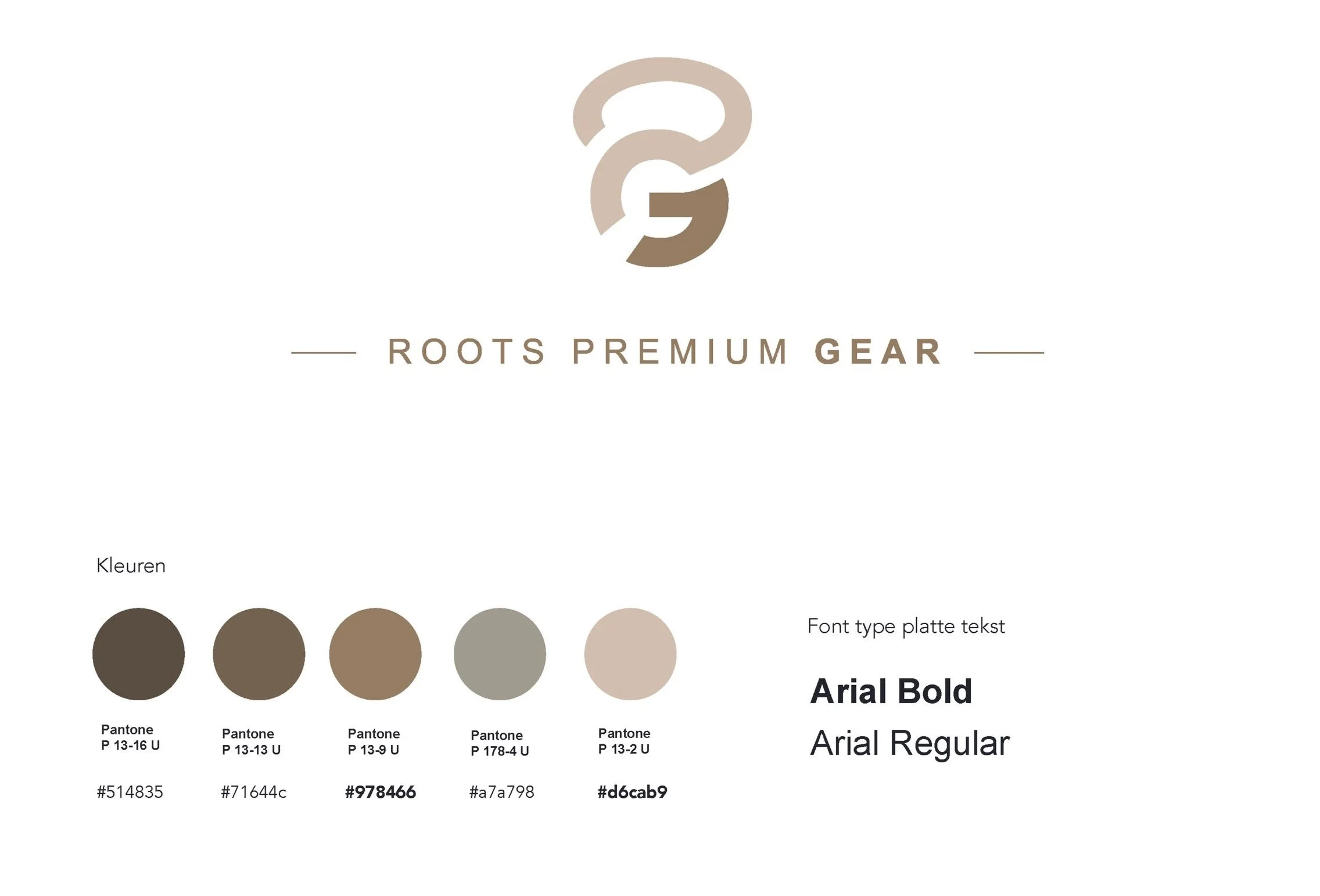
The client sought to expand their brand presence by introducing a new segment within ROOTS Premium Gym — ROOTS Premium Gear.
The vision was to establish a distinct sub-brand within the ROOTS family, necessitating a unique logo and a distinctive color scheme to set it apart from the primary brand image.
To maintain cohesiveness within the brand family, I crafted a distinctive mark incorporating the letter 'G', seamlessly integrated into the main kettlebell mark. This approach ensures a harmonious connection while giving ROOTS Premium Gear its own visual identity.


